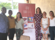

We are proud to announce that, in celebration of our 10th Anniversary, we’ve rebranded Ghana Relocation as “Dwell Ghana”.
We have spent the last several months working to create a brand and website that reflects the personalized and elevated experience we provide to each of our clients. It’s another huge step in our journey and it is an important part of establishing who we really are in the executive relocation space.
From the Adinkra-inspired logo to the timeless, yet modern, aesthetic – we hope our fresh design and online home captures the exceptional approach we take to facilitating every relocation.
In honour of our new identity, we want to give you a little peek into the vision and intention behind this exciting change – and what you can expect from us moving forward.
THE VISION
When we initially started the rebrand process, with marketing and communication consultant Tash Morgan-Etty, we didn’t have a clear picture of what we wanted our new brand to look like.
We did, however, know what we wanted it to feel like.
We want prospective clients to feel that their relocation will be well taken care of from day one with our professional and caring team by their side. We want them to feel a connection with us, our services, and our insight on Ghana. And we want them to feel like they can relate to us, feel confident in our ability to facilitate their relocation, and rest assured knowing that we will take all of their needs and preferences into account.
The client experience is, and always has been, at the center of our work. Our goal is to put our client’s needs first and foremost. With that in mind, we wanted our branding and website to be relatable and inviting, yet exclusive. We knew we also wanted it to be bright, clean and contemporary. Tash worked with us to create strategic branding, copy and design that reflects this.
We couldn’t possibly be more excited with the final product and only hope that it resonates just as much with you, too!
THE INTENTION BEHIND OUR NEW BRAND
So why the change?
Good question! We will always have a special place in our hearts for our original name, “Ghana Relocation”, and its later iteration “Step-In”, but near the end of 2017, we began thinking of what Ghana Relocation really meant to our customers and, in a larger sense, to the wider world. We felt something was missing and that we needed to figure out what that was before we took Ghana Relocation to the next level. The answer was easy once we started to explore the heart of what our company is all about.
It is the client. More specifically, it is the relationships we have built with our clients over the past 10 years. We began to realize that, while the voice we had developed internally was making an important connection with our clients, it wasn’t coming through in our overall brand or communications. We needed to put the customer at the center of who we are as a company.
RETHINKING WHO WE ARE
Just as our services are constantly evolving to meet our clients’ needs, we needed our brand to follow suit. Therefore, we decided to completely rebrand Ghana Relocation to better reflect who we are and what we do, in not only our name, but our tone of voice and visual identity as well.
And, if there’s one thing we’ve learned in 10 years in business, it’s that change is okay! In fact, it’s more than okay – it is inevitable. It is good for a company’s core vision to evolve and transform. Because the minute it stops, is the moment you’ve stopped growing.
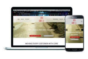
As our company has grown and evolved over the years, so too has our experience and the clients we serve. Because of that, we wanted our brand and web design to be reflective of our genuine approach and the elevated experience we provide each of our clients. It needed to communicate the high standards of our customer service, our proximity to our clients, and the in-depth knowledge of Ghana that we share with them.
And so, Dwell Ghana was born.
![]()
DWELL GHANA – CLIENT-FOCUSSED, ADAPTABLE, PROFESSIONAL
Dwell Ghana is a brand that we are very proud of, and which we feel finally represents who we are as a business. Dwell’s visual identity represents key characteristics that best define what we offer our clients. We are Client-Focussed, Adaptable, and Professional.
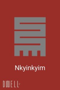
The idea of adaptability plays a key part in the makeup of our new logo, which is based on the West African “Nkyinkyim” Adinkra symbol. The Nkyinkyim symbol depicts the twists and turns in the journey of life, and signifies adaptability, initiative, dynamism, and versatility. We always adapt our services to our clients’ specific needs and preferences.
To add to this, the name “Dwell” creates a strong association with our core purpose and focus, which is to facilitate our clients’ move to Ghana, help them make it their new home, and assist them in finding a sense of belonging within this new environment.
We’ve also chosen a bold burgundy colour scheme, which is warm and welcoming, and gives a confident, professional air.
WHAT YOU CAN EXPECT
We may have a new look, but we are the same efficient, professional, and detail-orientated team! We will continue to offer relocation services solely for Ghana, and you can also expect to see numerous tips and resources for executives and their families moving to Ghana, as well as guides for HR executives and relocation companies placing assignees in Ghana, via our blog, newsletter and social media channels. And we’ll, of course, continue to go the extra mile to provide our clients with executive level service!
So, please join us in a toast to this new chapter! We look forward to you being a part of it!
Please take a look around our new website, and sign up for our new monthly newsletter. We look forward to sharing our insights on Ghana with you in the upcoming edition.
Warmest regards,
Angela and the Dwell Ghana team.